Project info
Space race
My role
Data visualization
UX design
UI design
Illustration
Design challenge
Convert a static csv document into an engaging interactive data visualization. This visualization should create a more clear and insightful image of the space race.
A personal project where I visualize data of the space race in an interactive prototype. I used data from a public csv file on the NASA website. The data shows all space missions from the USA, USSR/Russia and China from the 60s until the early 2010s. Each mission has more data about the specifics of the mission. It has a lot of interesting information, but it's hard to get a clear picture.
By giving the user multiple ways to interact and filter the data, lots of connections can be made to give more insight and impact in the data. Take for example: going through a timeline, visualizing distances traveled, showing the rockets, counters to "keep the score", and other filters to bring the data to life.
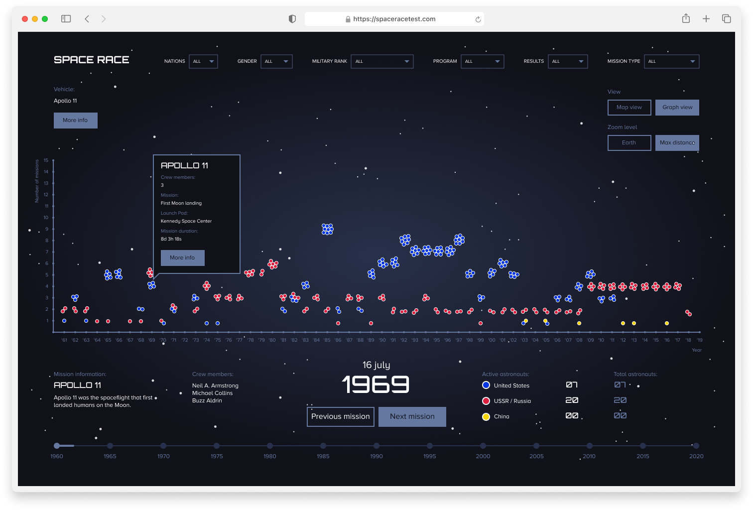
This dataset shows the big picture of the race by showcasing all the missions. In graph view it's clear how many missions existed during the space race, when they happened and by which nation.However there is also a layer of more detailed information. Information that tells a story about a specific mission. "Who was on board? Which rocket was used? What was the intention of the mission?" Map view tells the specific story of each flight. It shows the orbit, distance traveled, the rocket etc. This way the user can create an image of the mission at hand. The data is conveyed in a more storytelling fashion.
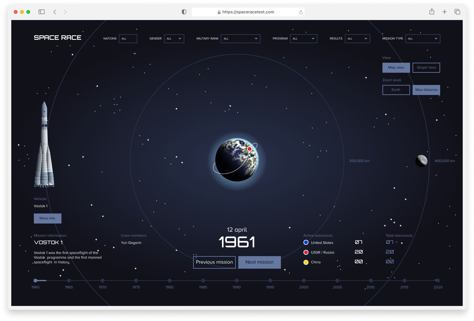
Timeline view with the Vostok 1 mission selected.
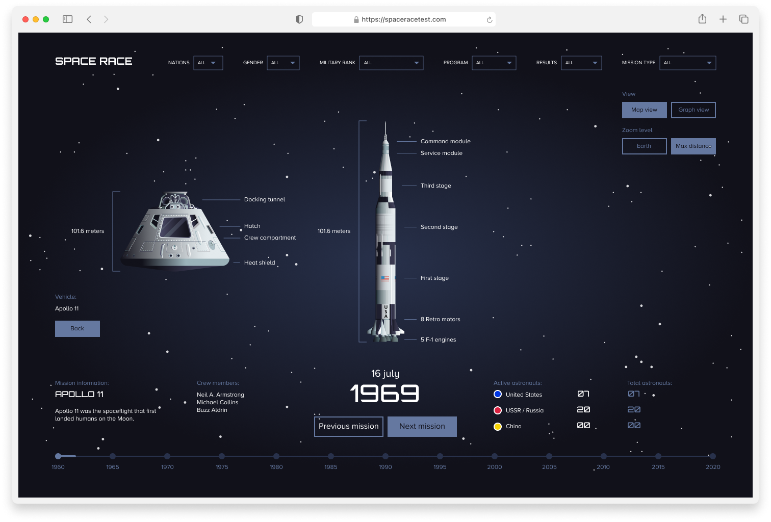
Visuals of the rocket and capsule of the Apollo space program.